
Cart + Consent Modernization
PROBLEM
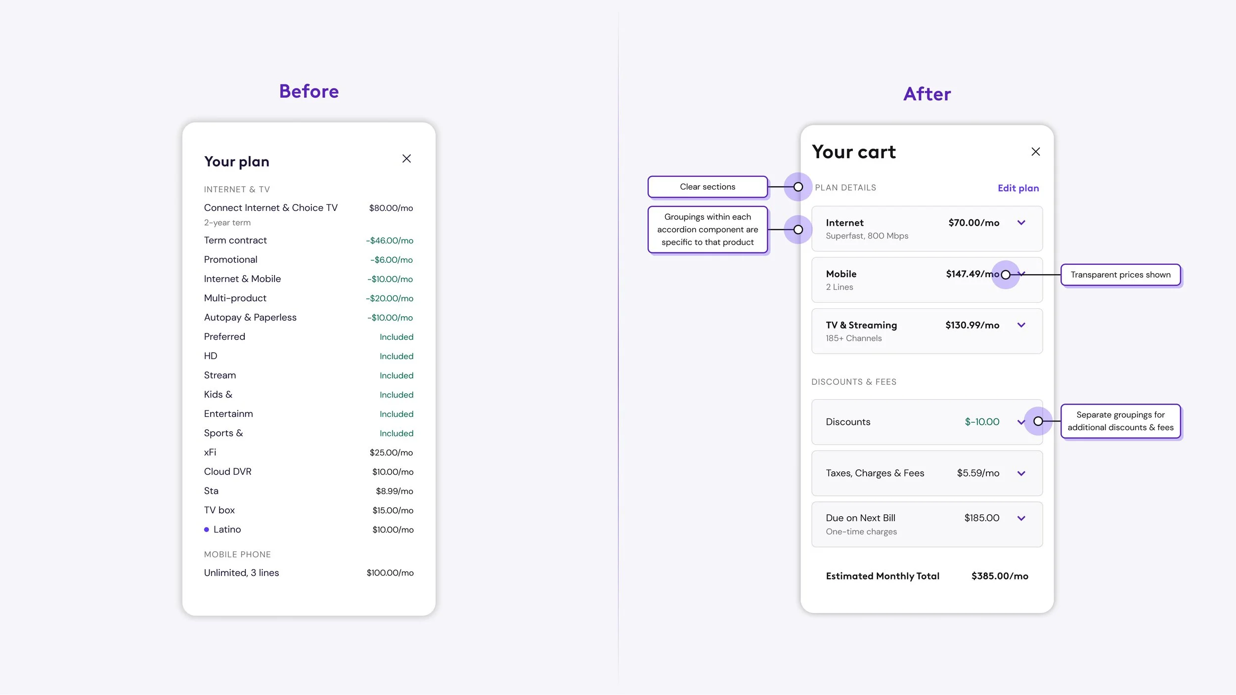
There were over 35 red flags in our system regarding inconsistencies of the cart experience, causing buy flow abandonment for customers who are shopping for Internet, mobile, entertainment and home security.
SOLUTION
Establish trust with our customers by creating a consistent shopping experience through use of clearer naming conventions, hierarchy, and organization of content.

Phase 1
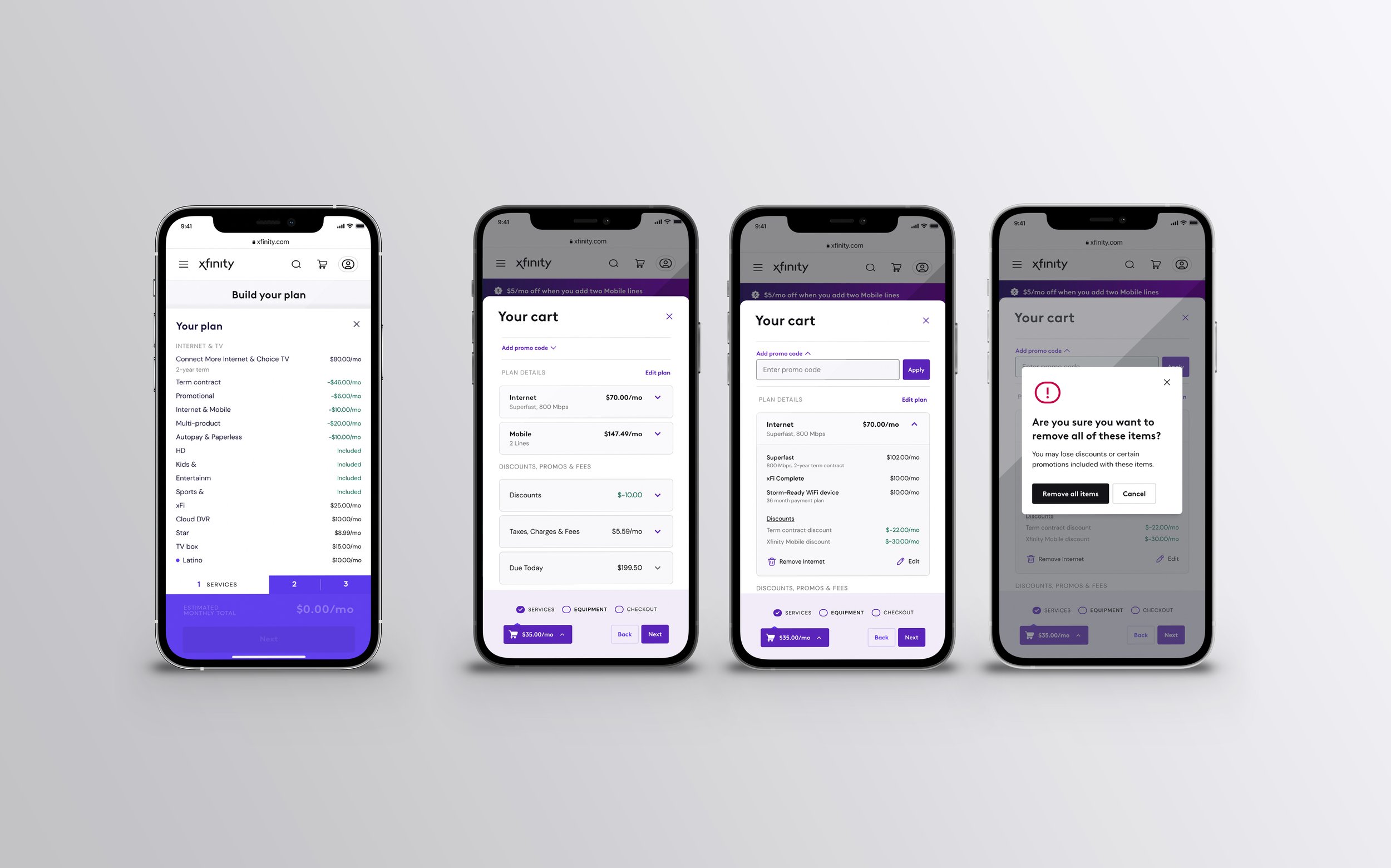
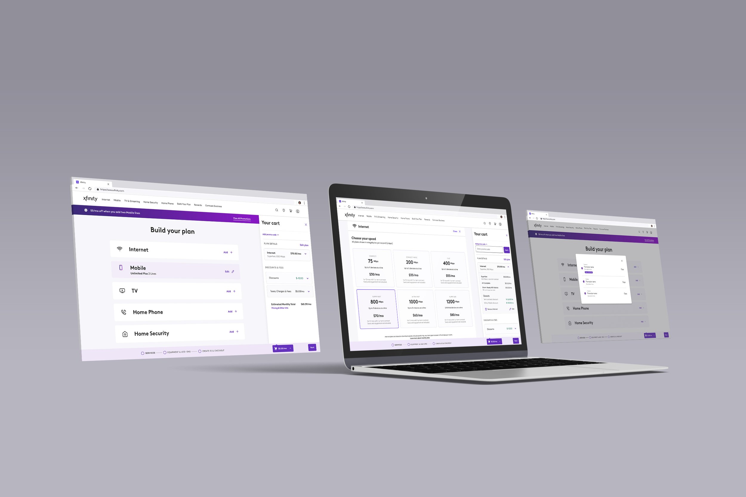
Phase 1 of this project was completed by Senior UX Designer Christianna Wenman before passing it off to me. She redesigned a slimmer sticky cart that allowed more space for content and shopping, she created an animation within the sticky cart that expresses a clear action, and, most importantly, implemented an expandable cart that allows the user to continue shopping with the dynamic cart simultaneously visible.
Phase 2 - My role
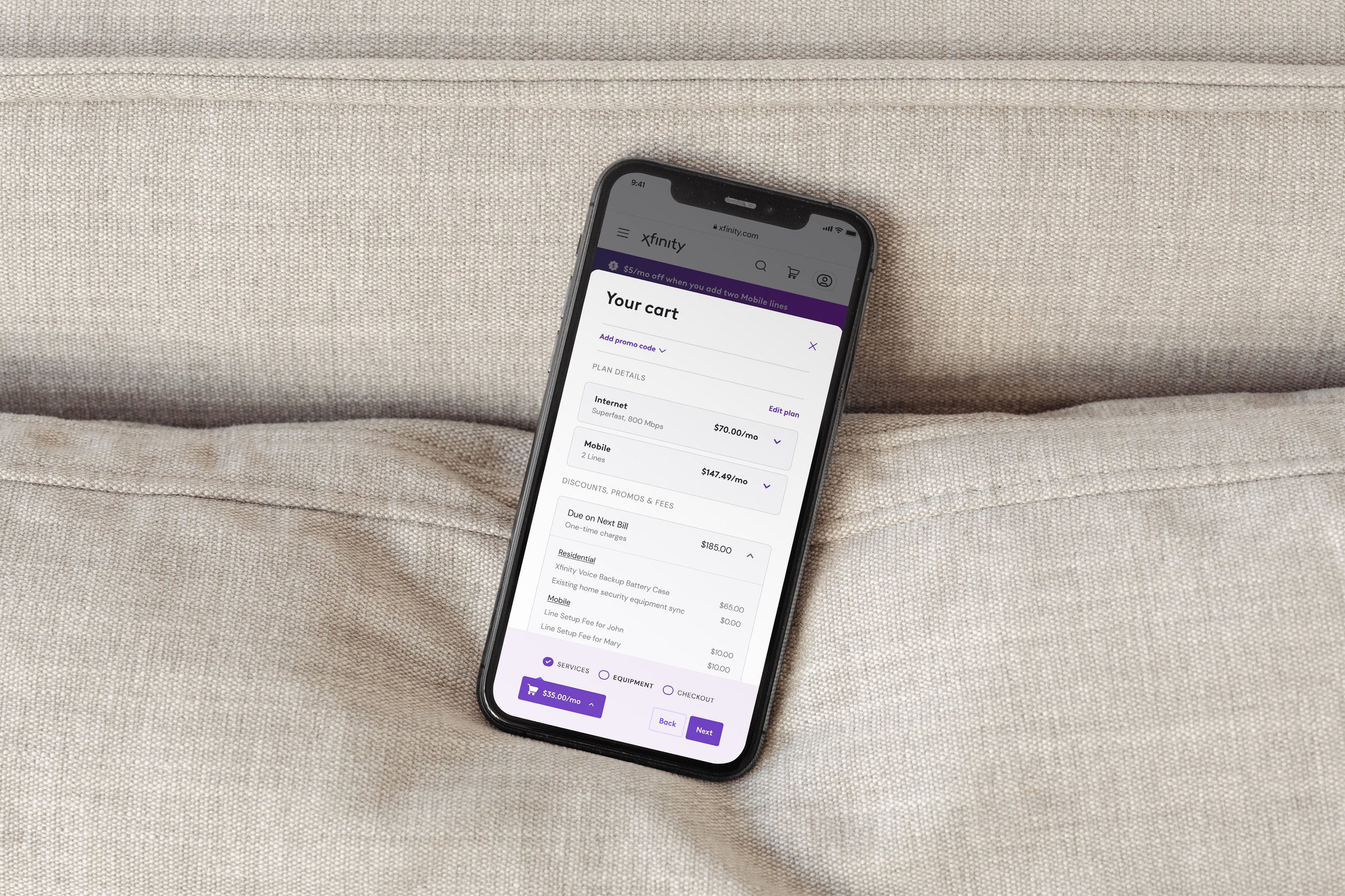
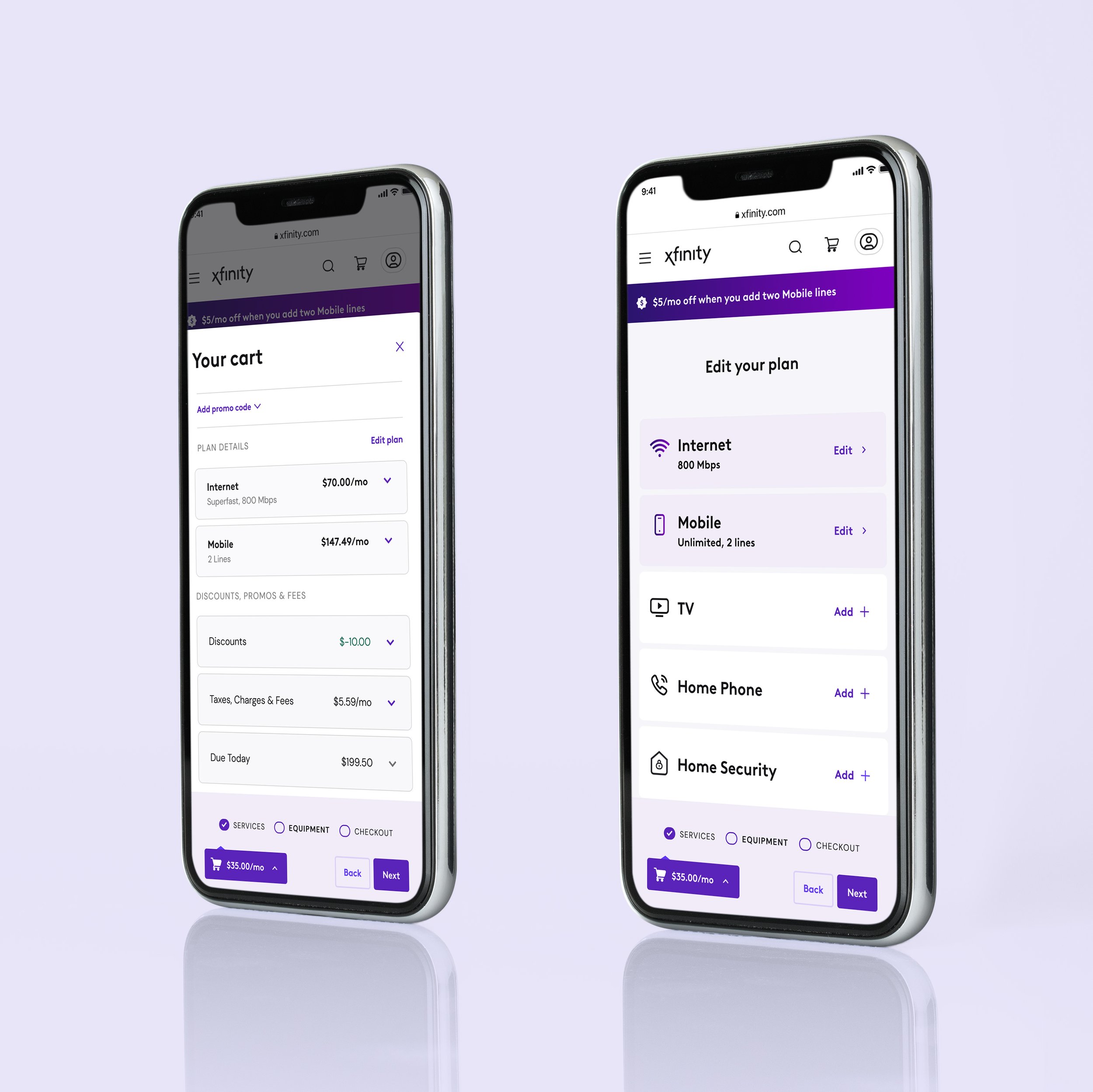
Phase 2 was the nitty gritty details. From clearer naming conventions and content hierarchy, determining how we are differentiating charges (monthly, one-time, next bill), to rolling out each use-case. Stepping into the mind of the user I was in charge of making sure this was a completely transparent, clear shopping experience from beginning to end so that every charge makes sense in order to gain back trust with our customer base.
Not shown within case study: redesigning our consent page to mirror this new cart structure.
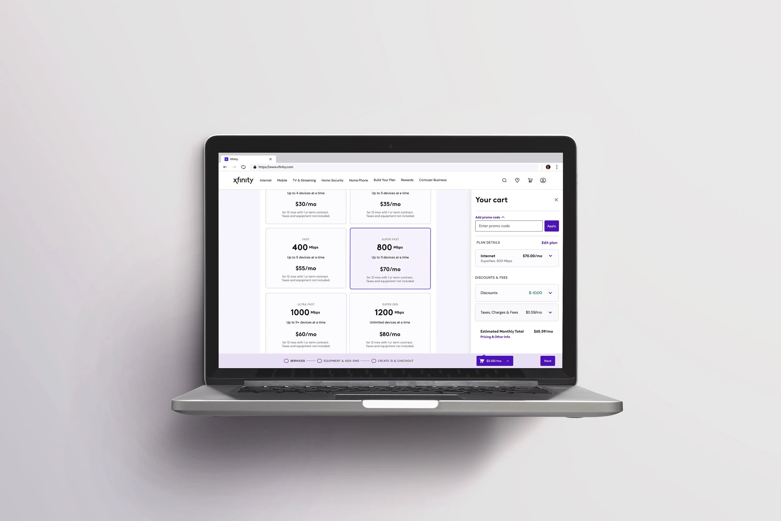
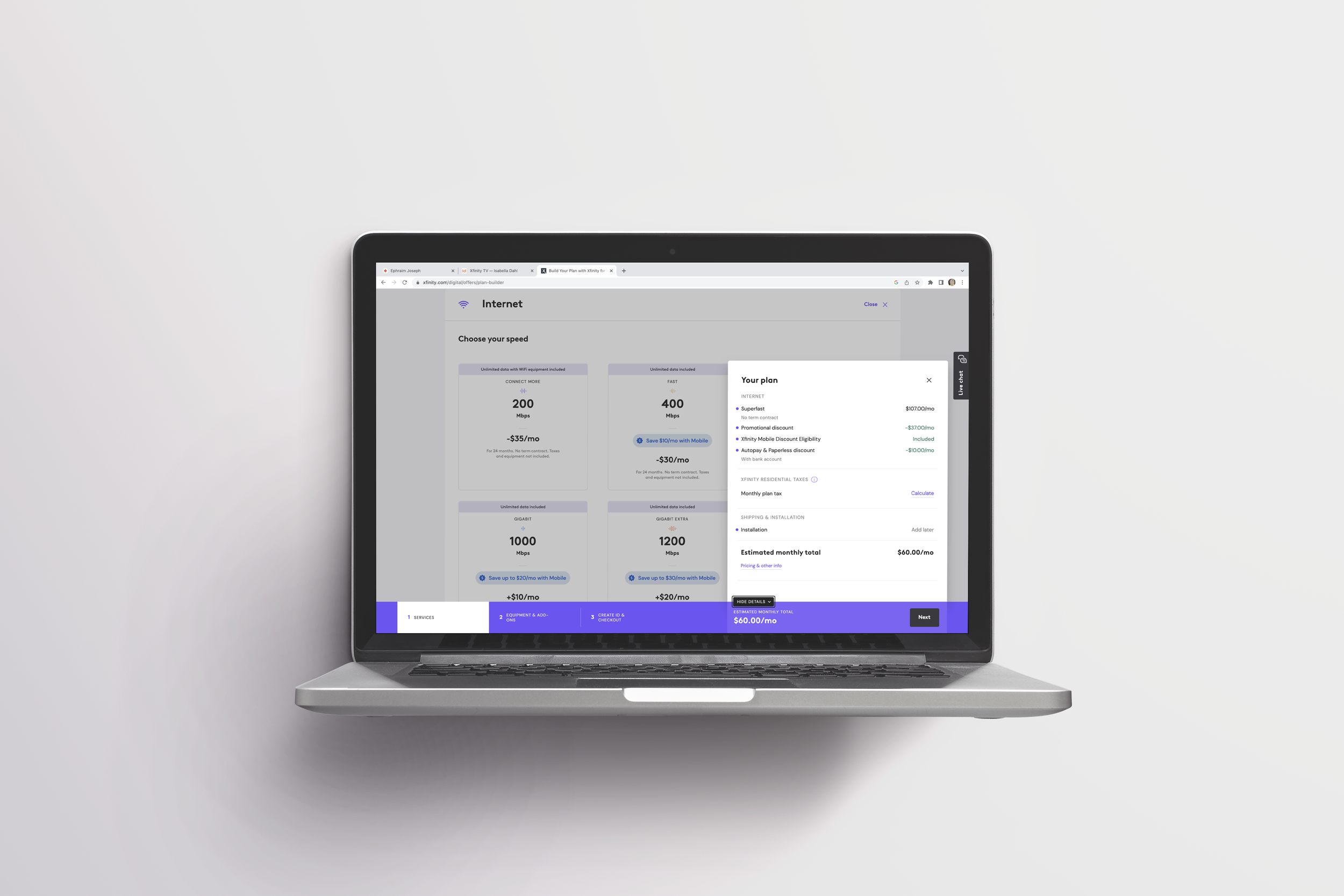
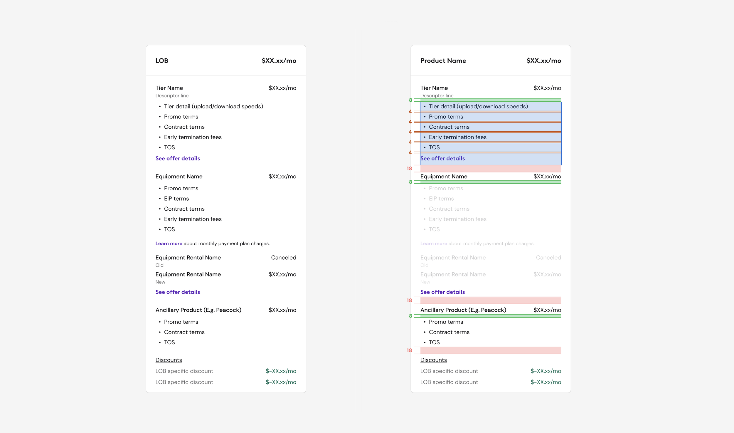
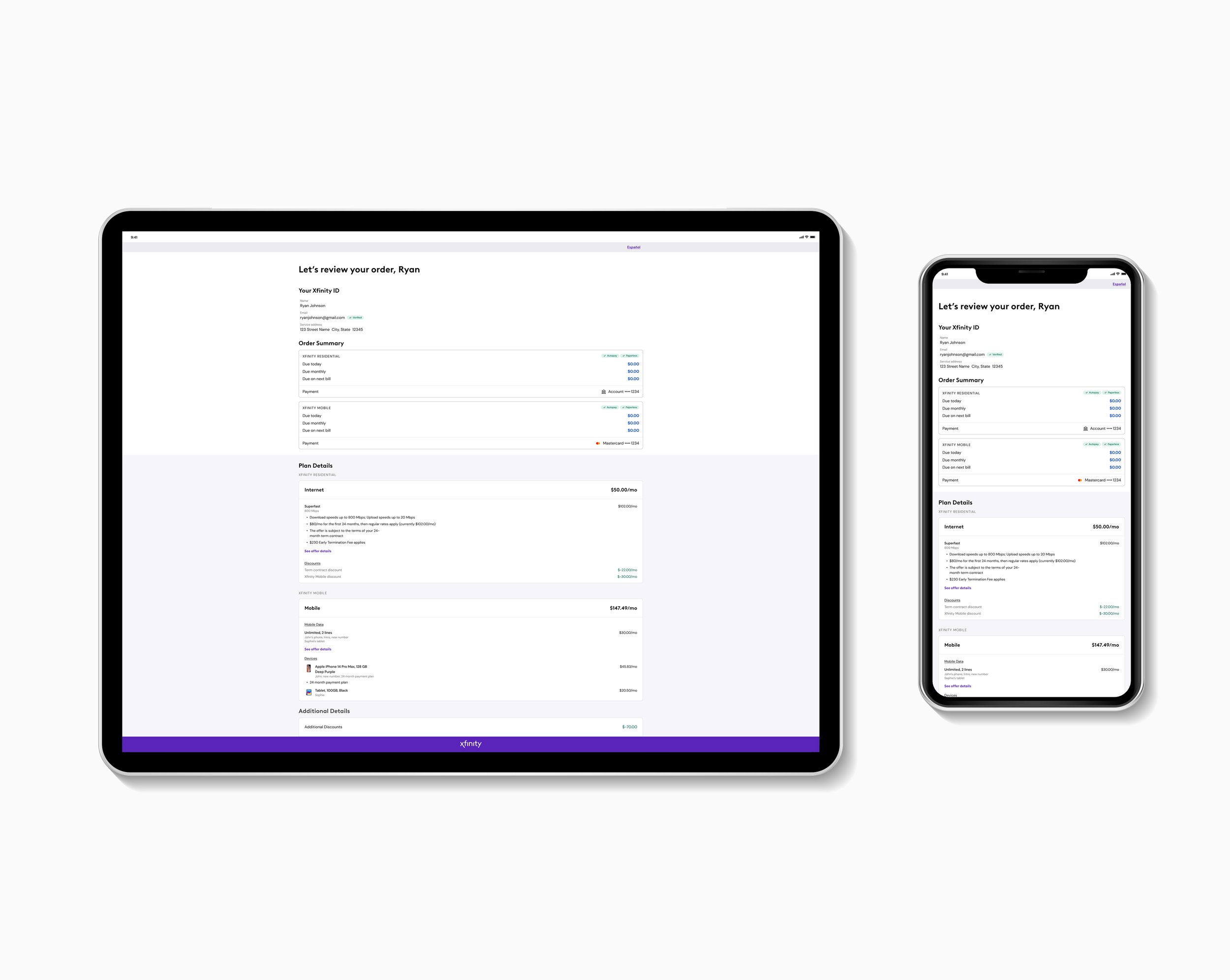
Providing clarity
Content organization and a smarter use of typography styles were key to ensuring a clearer and more transparent shopping cart experience. With expandable accordion components we are able to show a compact overview of cart items inclusive of the most crucial information: product, name and price. The ability to expand empowers the user the find further details as needed.

Consent Page
Product Experience Lead:
Hannah Shevlin
Senior UX Designer:
Christianna Wenman
UX/UI Designer:
Renee D’Angelo